


Disclaimer: The recommendations provided below are general guidelines and may vary slightly depending on the device your users are accessing your app on. Different devices such as desktops, tablets, and smartphones have varying screen sizes and display resolutions, which can impact the optimal image and video sizes. Please adjust these recommendations based on your specific needs and the target audience of your application.
Creating a visually appealing and user-friendly interface is crucial when building your Movement app. Properly sizing images and videos ensures that your app looks polished and professional. However, it's important to note that there is no one-size-fits-all solution due to the diversity of devices and screen sizes in use today. Here, we provide general recommendations for different elements within your app, but keep in mind that flexibility and adaptability are key.
App Icon
The app icon is a crucial element of your app that represents your brand. This is the icon users will see when they download your app to their device's home screen. For best results, it is recommended to design your app icon at a dimension of 512x512 pixels. 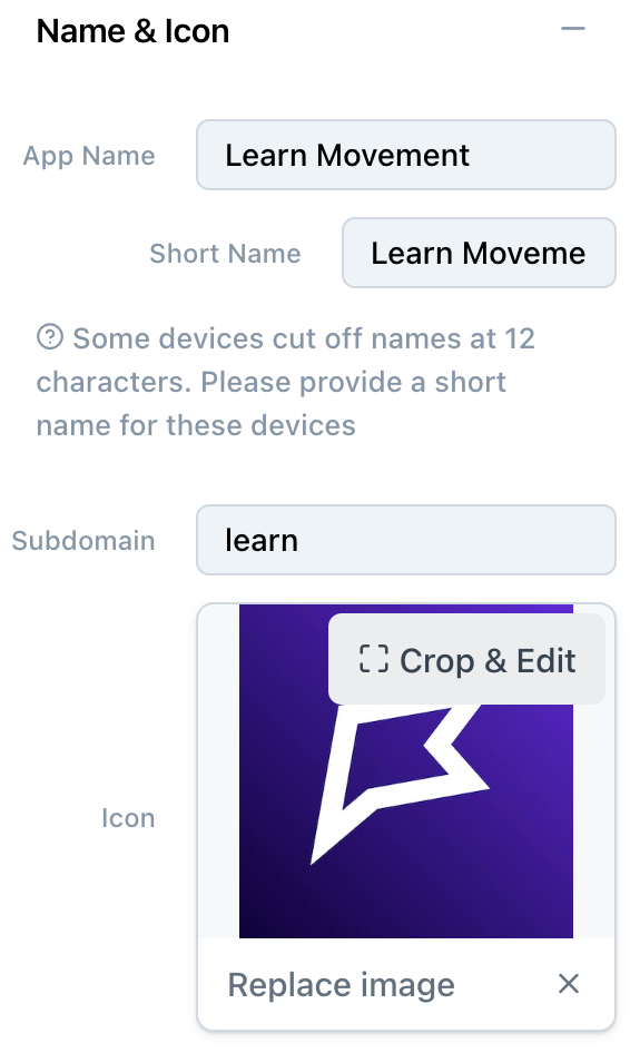
Navbar Logo
The navbar situated at the top of the screen houses essential elements like your sidebar navigation, back button and bookmark button. When adding a logo to this toolbar, a height of 120 pixels is recommended & the shape can vary. Rectangles are generally more versatile, but circles and squares can also be used. It's essential to consider the overall design aesthetics of your app when choosing the shape of the toolbar icon. The height of this navbar can also be adjusted with the slider. 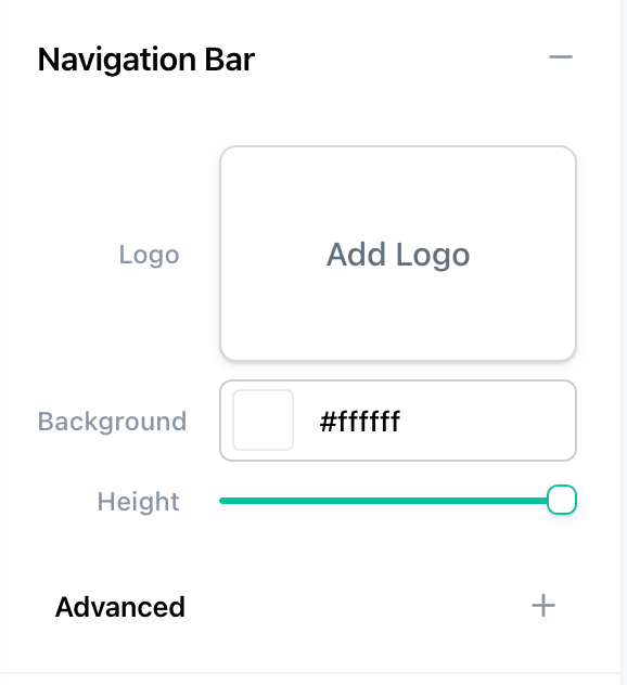
Hero Images/ Videos
Hero blocks are often the first visual element users encounter, making them crucial for making a strong impression. Hero blocks can be more flexible in size. They can be cropped and resized based on your design preferences and the specific layout of your app. As there are no strict size recommendations, feel free to experiment with different image and video dimensions that suit your app's design. Our Media Controls and Image Scaling articles go into more detail about how to resize and scale hero blocks. 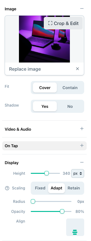
Videos in Workouts
While it depends on your use case, we find that 4:3 aspect ratio is a good balance for both mobile and desktop video support.
Exercise Modal: Videos displayed in an exercise modal, will render with an aspect ratio of 5:4 (width/height) on mobile.
Follow Along: Follow-along videos in a workout render with a 1:1 (square) aspect ratio. This ratio ensures that the video content remains centered and visually appealing regardless of the user's device.
Supported video types for direct video upload:
"avi"
"mov"
"mp4"
"mpg"
"mkv"
"m4v'
"wmy"
"ogv"
"fly"l
"webm"
"3gp"
"3g2"
In conclusion, while these recommendations offer a starting point, it's essential to test your app on different devices to ensure images and videos are displayed optimally. Keep in mind the diverse range of screen sizes and resolutions your users may have and be prepared to adjust image and video sizes accordingly.